 THE BETTER
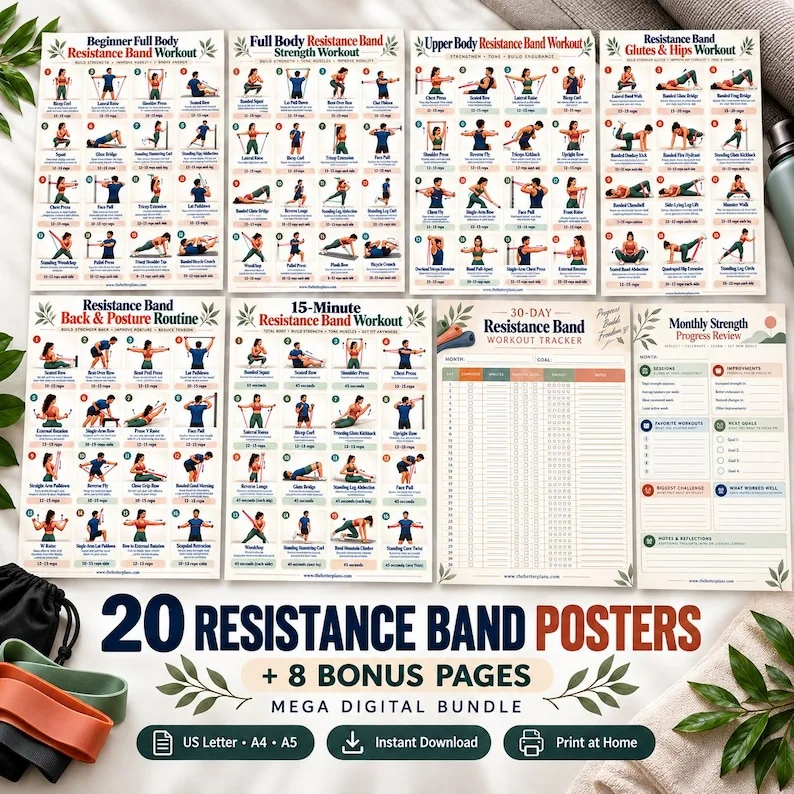
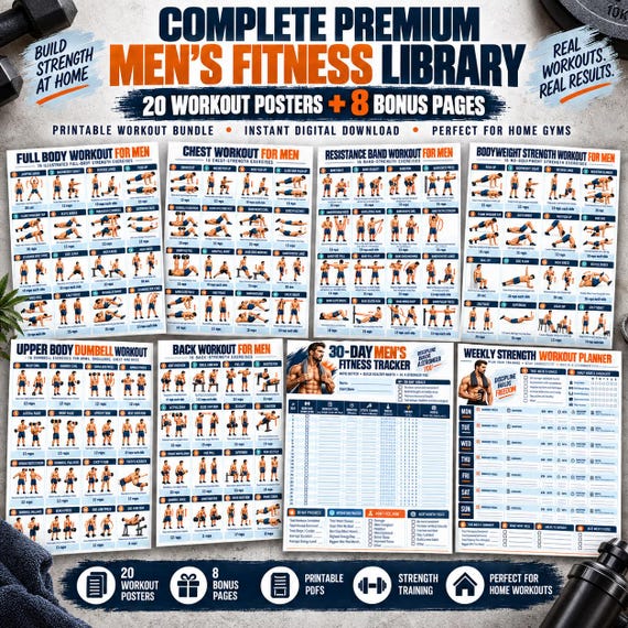
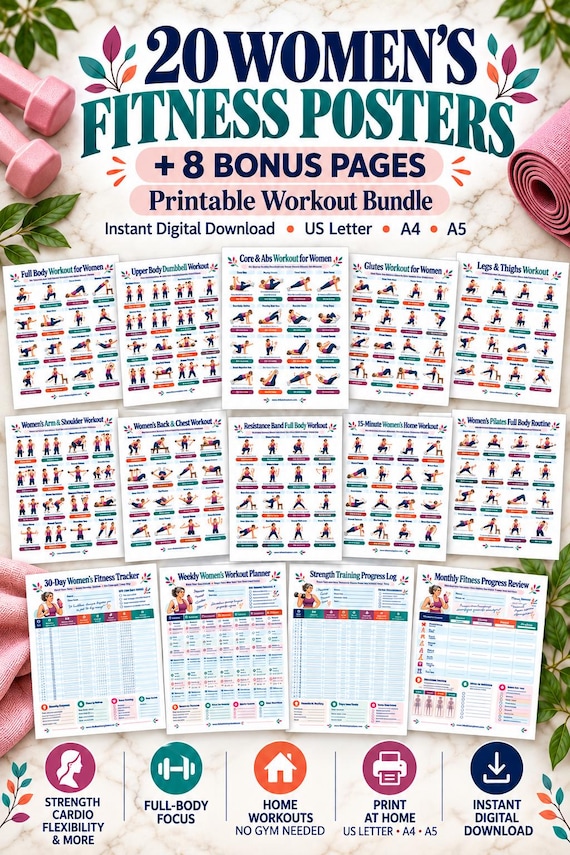
A workout poster can look excellent in a room and still be awkward to read when you need it. Glare, an angled frame, small captions and an inconvenient display position can make a reference less useful than expected. Planning the display is a practical reading task. It should help you consult familiar material clearly, not encourage you to keep moving while decoding an unfamiliar instruction. This guide focuses on placement, visibility and document handling without prescribing movement technique or claiming that one room arrangement fits every person.
Choose the reading position before the decorative position
Begin with how you intend to consult the page. Will you read it at a desk before an established session, pause to inspect it nearby, or use it as a broad reminder between activities? Those uses imply different viewing distances and handling needs. A poster hung above a decorative shelf may suit the room photograph but require effort to examine its smallest text. Give readability priority over matching the gallery's composition.
Use an ordinary reading check while you are not exercising. Place a temporary print or the open file where you think it belongs and read the captions from the intended consulting spot. If you must lean around furniture, rotate the sheet repeatedly or guess a word, revise the placement. This check concerns the document's accessibility in your room. It is not a test that establishes whether the pictured activity is appropriate for you.
Check angle, reflections and changing light
Look at the page from the actual consulting position rather than straight in front of it only. An angled frame can make a dense grid harder to inspect, and a reflective surface can hide text under certain room lighting. Observe the title, a middle caption and the smallest contextual note. If one region disappears behind a reflection, the reference is not consistently readable. Try a different position or a less reflective presentation rather than assuming larger type alone will solve the issue.
Repeat the reading check under the light you usually use when consulting the page. A clear daytime view does not guarantee the same result with a nearby lamp. You do not need a measurement tool to notice whether reflections obstruct a caption. Write down the practical problem: lamp reflection over lower notes, or page angled away from chair. A concrete observation leads to a specific adjustment, unlike a general judgment that the poster feels wrong.

Preserve the information around the illustration
Check the frame or mounting method against the full page. Some designs place a legend, edition note or contextual sentence close to the edge. A border or cropped mount can cover it even when the main figures remain visible. Compare the displayed sheet with the original PDF and make sure no useful information disappeared. The goal is to present the document clearly, not to create a cleaner-looking version that silently removes part of its explanation.
If a larger print is needed, keep the full-page proportions where possible and inspect the result. Enlarging a tiny screenshot can make edges fuzzy without revealing clearer text. Use the actual supplied file and an appropriate edition. If the publication remains too dense for distant reading, consider using it as a nearby reference rather than forcing a wall display. The format should serve its actual information layout.
Create a convenient way to pause and consult
Plan a clear break in which you can stop, approach the page or open the accompanying guide. A poster should not pressure you to follow an unfamiliar sequence while trying to decipher a caption from across the room. If your established instruction requires a fuller explanation, keep that source accessible. The wall reference can remind you which page to consult without being asked to perform every instructional role at once.
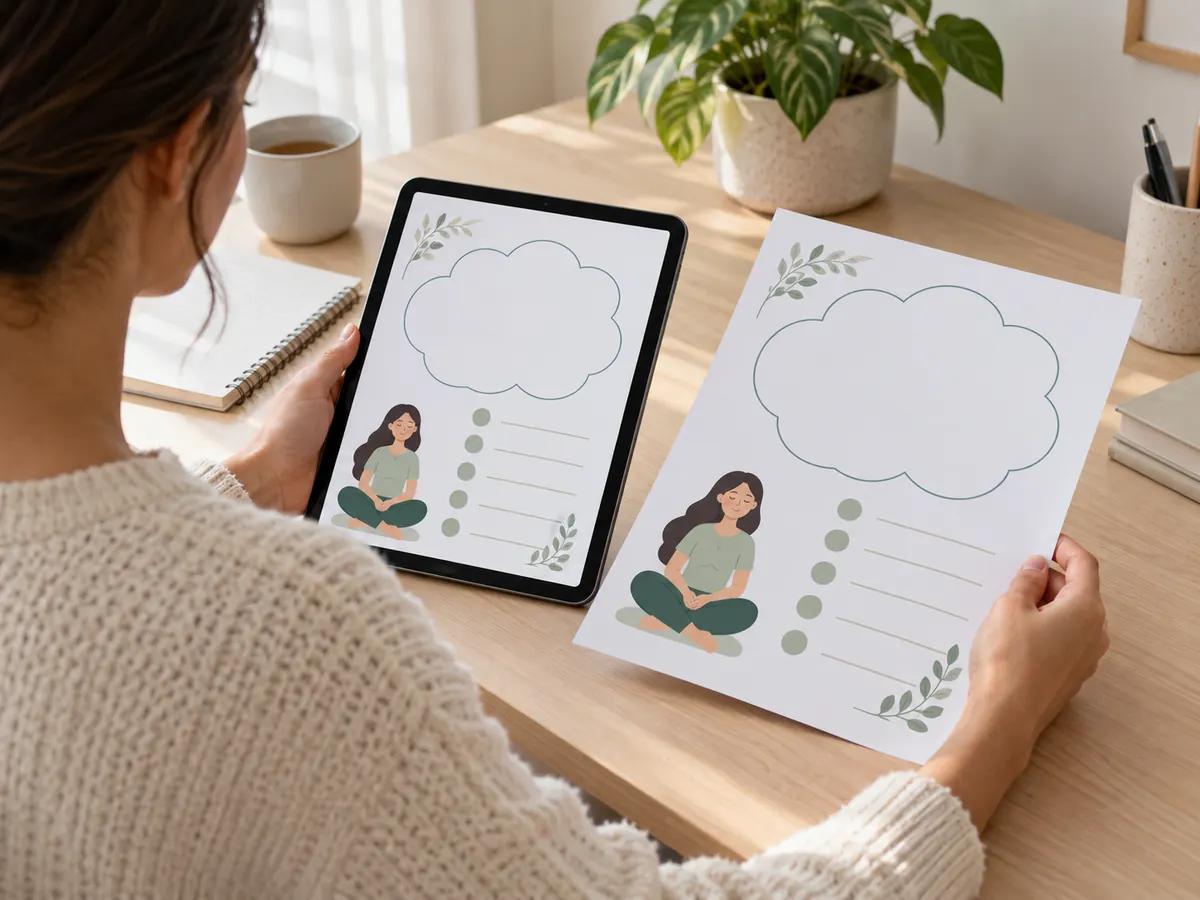
For a booklet or tablet, choose a stable reading arrangement and a straightforward way to find the right page. Bookmarks, page numbers and an index can reduce searching. Keep unrelated notifications or loose pages from turning the consultation into a distracting task. These organizational choices help the reference work as a reference. They do not verify technique, replace an instructor or turn a readable picture into complete knowledge of a movement.
Compare wall, desk and portable formats
A wall display offers a visible overview and leaves the page in one place. A desk copy lets you read small text closely and keep personal questions beside it. A portable folder can travel to a coaching appointment with the original captions intact. Compare these formats by the information task they support. There is no need to choose one forever: an overview can stay on the wall while the detailed guide remains in a labeled folder.
Keep editions aligned when using several formats. If your wall sheet is an older version and the desk guide has revised labels, mark the difference or replace the outdated copy. Otherwise, the arrangement can create confusion even when both pages are readable. A small record with title, filename and print date makes replacement easier. Do not depend on memory when several collections use similar colors and page titles.
Work through a practical placement example
Imagine you have a dense poster with sixteen illustrated entries and a separate guide. You first hang it above a cabinet because the arrangement looks tidy. From the intended reading spot, the bottom captions are blocked by a reflection and the guide page references are too small. The poster is still a useful collection, but the current display does not support your consulting task. Record those two problems separately so you can assess whether a change solves both.
Move the temporary copy to a flatter viewing angle and check it under the same lamp. Suppose the glare improves but the tiny guide references remain unreadable. You could keep the poster as an overview and use a nearby desk copy for the page references. That is a more precise decision than endlessly moving the frame. It recognizes the limits of the design at that distance rather than expecting a decorative wall position to make every detail legible.
Finally, make the accompanying guide easy to locate and note which edition corresponds to the displayed poster. During an ordinary pause, verify that you can find one named entry and its guide page without searching the entire bundle. If you cannot, improve the index rather than trying to memorize the missing connection. The finished setup is successful when it helps you consult understood material and locate further explanation conveniently. Its appearance can support that purpose, but appearance alone is not the quality test.
Choose poster placement through a real reading check, preserve captions and keep fuller guidance accessible. A clear display supports consultation; it does not make a poster a substitute for instruction.
Written for general information by The Better Plans. Exercise and wellness content cannot diagnose a condition or replace individual professional advice. The Better Plans also sells digital products on Etsy, but this article is free to read and requires no purchase. Read our editorial policy or send a correction.