 THE BETTER
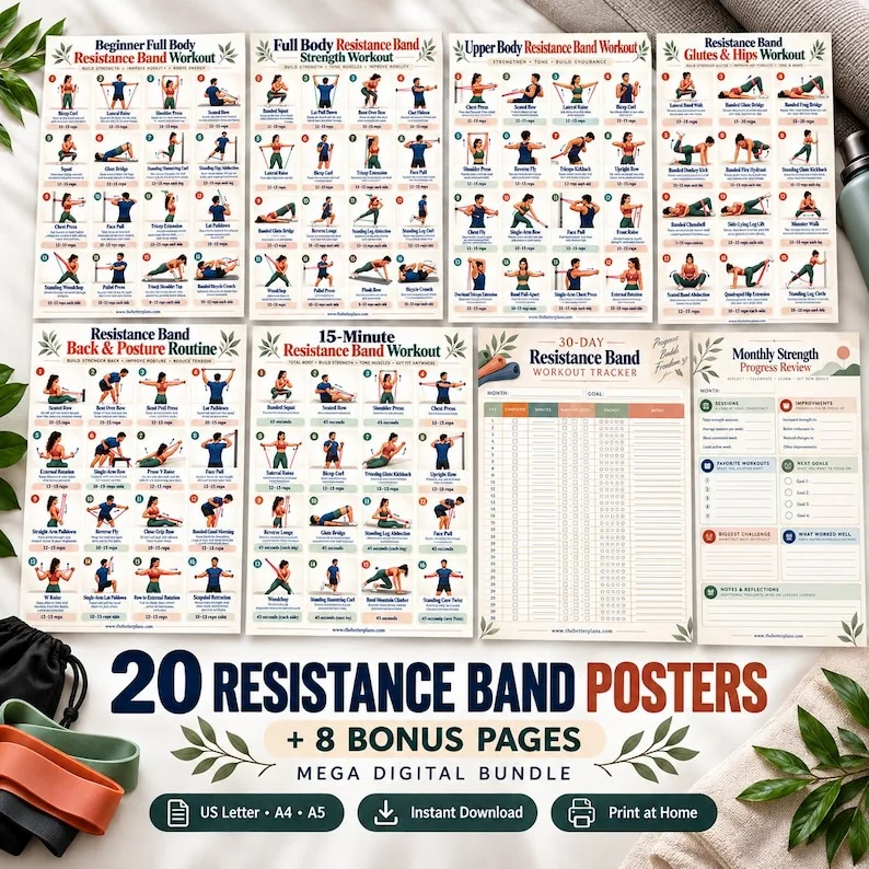
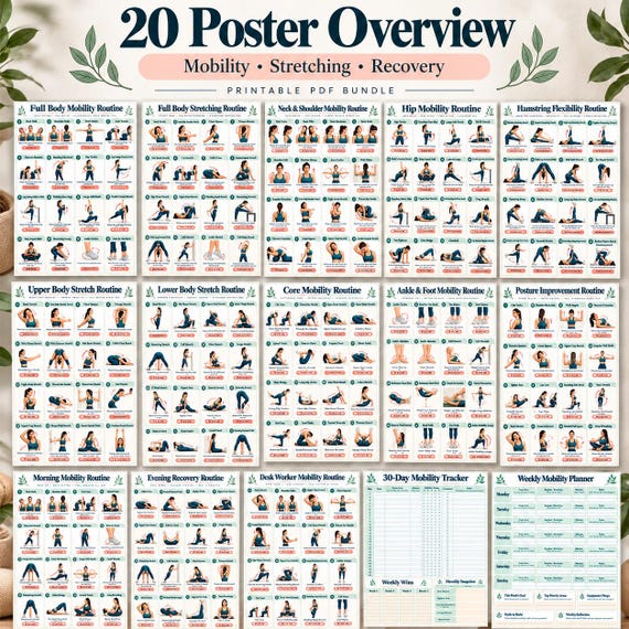
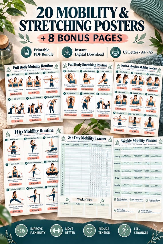
A product image can show a workbook clearly, or it can show how attractive that workbook looks in a styled setting. Those are different kinds of evidence. A mockup is useful for presentation, while a direct sample can reveal instructions, spacing and page structure. The practical skill is knowing which questions each image can answer. This guide focuses on visual evidence rather than a general shopping checklist, so you can compare a sample with its presentation without mistaking decoration for included content.
Identify the kind of image you are viewing
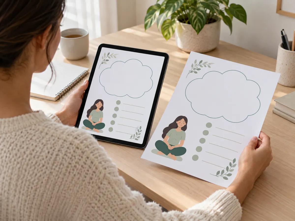
First decide whether the image is a direct page view, a photograph of a printed page, a digital device presentation or a decorative composition. A direct page view usually makes its rectangular boundaries and text visible without perspective. A styled desk scene may partially hide the edges or place objects over the sheet. A tablet presentation shows a display context but does not prove that an app, animation or interactive feature is included.
Imagine a workbook displayed on a tablet beside a pen and a water bottle. The downloadable product may be a static PDF, while the pen and bottle are props. Likewise, a stack of sheets can suggest thickness without showing how many distinct pages exist. Write down what is actually visible before interpreting the scene. A page title and three readable instructions are evidence; a thick-looking stack is an impression. This distinction makes your questions more precise and less dependent on the image's styling.
Compare identical page details
If the gallery offers both a styled image and a direct sample, locate the same page title in each. Compare illustration count, label wording, page numbering and the placement of instructions. Perspective can make text look compressed, and a crop can remove footnotes. A matching title does not guarantee that both pictures show the same edition, so look for a second identifying feature such as a unique subtitle or diagram arrangement.
For a hypothetical twenty-page workbook, a mockup might show the introduction while the sample displays an exercise reference. Do not compare their text density as though one is a higher-resolution version of the other. Instead, ask whether a direct sample of the page shown in the mockup is available. If the title or layout differs, the difference may reflect an update, a size variant or an unrelated preview. Keep it as an unresolved question until the seller explains the relationship.

Evaluate reading evidence at realistic scale
A sample enlarged to fill your screen can look readable even when the intended print size is small. Use it to examine the hierarchy: which words are headings, which are labels, and where explanatory sentences sit. Then consider whether those elements will remain comfortable to read at your intended size. You cannot calculate exact print legibility from every gallery image, but you can identify pages where the smallest instruction appears unusually crowded.
Avoid judging only the large title. Find a movement cue, a numbered step and any caution or note. If these cannot be read even in a clear sample, request a closer view. A decorative room mockup is particularly weak evidence for small-text clarity because the sheet may occupy only a fraction of the picture. The right request is a full page sample at readable resolution, not a demand that every gallery image reveal the entire paid workbook.
Separate page features from presentation effects
Drop shadows, curved edges, glowing screens and floating sheets can make a static product feel dynamic. They are presentation effects unless the description explicitly identifies an interactive component. An arrow printed on a page indicates a direction; it does not mean the file contains animation. A hand holding a booklet demonstrates a physical viewing context; it does not mean a physical booklet will arrive. Check the stated format before attributing functionality to the scene.
A useful comparison note has two headings: visible document features and presentation features. Put page numbers, diagrams and writing fields under the first. Put frames, devices, props and shadows under the second. This prevents a polished composition from quietly expanding your expectation of delivery. If the seller provides a video, examine whether it demonstrates the actual file or simply moves through promotional pictures. Both can be informative, but only an actual file demonstration establishes the behavior being shown.
Look for the work the buyer must do
A workbook sample can reveal whether it is primarily for reading, recording or following references. Look for blank fields, instructions about those fields, navigation cues and any continuation across pages. A page containing empty boxes may require handwriting; it is not automatically a fillable form. A checklist might be intended for printing rather than digital selection. The appearance of a writing area tells you its role, but not whether your PDF viewer can type into it.
Suppose a sample has a date field, a notes area and several printed illustrations. Ask whether those fields are digitally fillable if that matters to you. If not, decide whether handwriting or annotation is acceptable. This question is distinct from exercise suitability: it concerns how you interact with the document. A sample should help you understand the effort involved after purchase, including reading small notes, locating a separate guide or using a companion log. Styled images often conceal this practical workflow.
Create a visual discrepancy list
Record specific differences instead of deciding that a gallery is generally misleading. Examples include the sample says fifteen pages while the description says twenty; the mockup shows colour while the supplied sample is monochrome; or the sample title differs from the advertised edition. Include the image number where possible. Some discrepancies have straightforward explanations, such as a separate bonus or different paper size. A concise list lets the seller address each point without guessing what worried you.
Do not treat every difference as a defect. A cropped promotional image may intentionally emphasize the heading, while the actual page contains fuller guidance. Your aim is to verify that the finished document matches the relevant promises. Ask which image represents the delivered page and whether the sample is current. If the seller cannot clarify a detail central to your intended use, keep that uncertainty in your decision. Confidence should follow evidence, not simply the attractiveness or number of the pictures.
Choose based on document evidence
Before buying, describe the finished document in one sentence using only confirmed details. For example: a static, printable workbook containing illustrated references and blank recording pages, supplied in two sizes. Then describe what remains unknown, such as digital form fields or exact instruction depth. This exercise separates a product you understand from a scene you merely like. You can still appreciate the styling while asking for stronger evidence about the actual file.
After delivery, open the real document and compare it with that sentence. Check the stated edition, the page you reviewed and the promised format before spending time printing the whole collection. If something differs, report the specific mismatch with a cropped screenshot that shows the relevant page. Do not include unrelated personal notes. A useful mockup starts interest; a clear sample supports a decision; the delivered PDF is the final place to verify the details you were promised.
Use styled images to understand presentation and direct samples to inspect the document. Confirm format, edition and unclear features before assuming the gallery demonstrates the complete buyer experience.
Written for general information by The Better Plans. Exercise and wellness content cannot diagnose a condition or replace individual professional advice. The Better Plans also sells digital products on Etsy, but this article is free to read and requires no purchase. Read our editorial policy or send a correction.