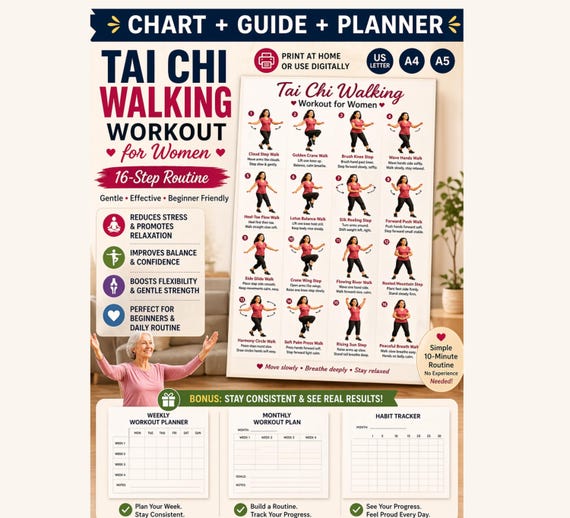
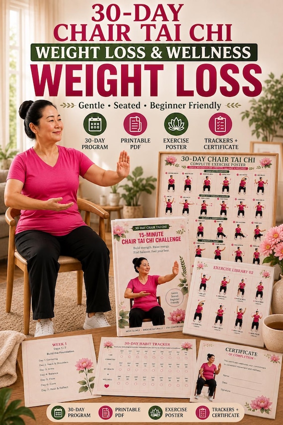
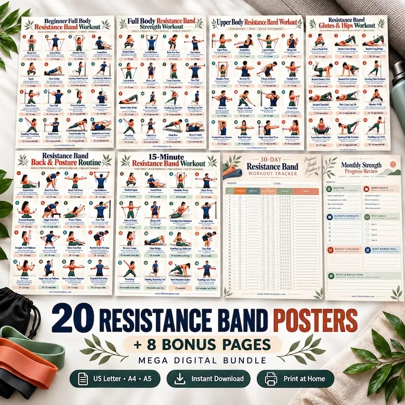
 THE BETTER
A sharp digital file can still produce a disappointing print if the page is reduced too far or the printer crops the edges. The best test is a practical one: print a sample and look at it from the place you will actually use it.
Start with the correct file
Check whether the download supplies a poster as PDF, PNG or both. Open the full purchased file rather than saving a gallery thumbnail. Find the size intended for your paper, and verify whether the poster is portrait or landscape.
If several files are included, name them clearly before printing. Letter and A4 are close but not identical; a wrong paper selection can shrink content or change margins. Read the printer preview before using ink and paper on a full run.
Inspect scale and edges
Printer settings such as actual size, fit and borderless produce different results. If the preview clips a label, choose a setting that keeps the entire design visible. If fitting it to the paper makes the words too small, a larger paper or screen display may be more appropriate.
Print a test page at ordinary quality first. Look at the smallest movement cue and the lightest colored label. If either disappears, changing ink quality alone may not help; a different file size or placement could be the answer.

Test from a real reading distance
A chart is meant to be read where you move. Place the test print in its intended spot and check whether you can make out the exercise names without stepping close. If not, use a full-page guide on a table or a zoomable device instead.
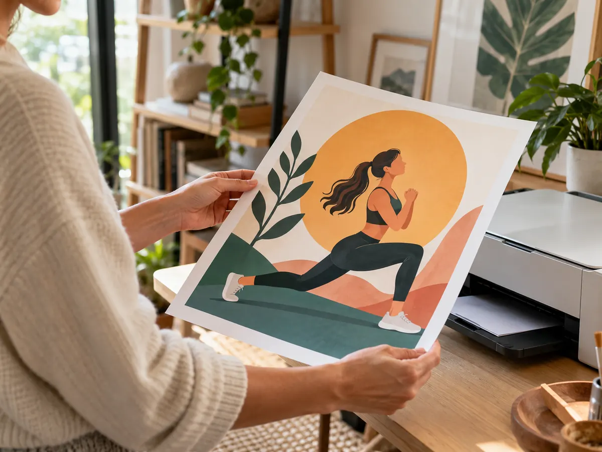
A home printout does not need to look like a styled mockup to be useful. Clear text, visible arrows and a predictable page order matter more than a frame. Keep the original digital file for future print attempts.
Inspect the source before choosing paper
Open the PDF at 100 percent and zoom into the smallest labels. A print can reproduce only the detail in the file. If arrows and words look blurry on screen, using expensive paper will not restore missing information.
Check the document dimensions in your PDF viewer. A poster built for a large sheet may have tiny labels when squeezed onto A4 or US Letter. A standard print size may be fine for a close reference but not for a wall chart read from across a room.
Compare the listing description with the downloaded files. Some purchases include several sizes; choose the matching one instead of scaling an unrelated page. Keep a copy of the original in case you need another print later.

Run a one-page test
Print one page at the intended size. Look at the resulting text from the distance at which you plan to use the poster. Can you read the movement name and see the sequence number without stepping closer? That simple test is more informative than an on-screen mockup.
Review your printer setting for fit to page versus actual size. Fit to page can shrink the artwork inside printable margins. If the file is sized correctly and the printer supports it, try actual size; otherwise inspect the preview before printing.
Black-and-white printing may make colored stages look identical. Check whether arrows, labels and line weight still distinguish the steps. If color carries essential meaning, use a color print or a different guide with clearer labels.
Place the poster at a useful height
A poster works best when its text is visible from the starting position. Hang it where glare, furniture and shadows do not hide instructions. If the routine includes seated and standing parts, check visibility from both positions.
Protect a frequently used sheet from curling or slipping, but avoid a glossy cover if it reflects a bright window. A simple matte sleeve may help where the poster is handled often. Test the view rather than choosing framing purely for appearance.
Do not look at a distant poster while trying to hold an unfamiliar position. Read the next step while paused and seek instruction when a movement remains unclear. The paper is a reminder, not live feedback about technique.
Know when to use a guide instead
If the labels need to be very small to fit the entire sequence, a multi-page guide might be more readable. You can keep a compact overview poster and refer to a larger detailed page before practice. Both formats can serve different moments.
For a long routine, consider printing only the current section at a larger size. Keep page numbers or titles visible so the order is unambiguous. Avoid cropping away support notes or cautions simply to make an image bigger.
A successful print is one you can read where you actually use it. Save paper and ink by testing a single page, adjust the size or format and only then print the remaining set.
A quick print troubleshooting sequence
If a sample print is too small, first confirm that you chose the intended page size and the right file variant. Next inspect the print preview for unexpected margins or automatic scaling. If the original labels are sharp, a larger supported paper size may help. If the source artwork itself is blurry, enlargement will only spread the blur.
If an image is cropped, do not cut away step numbers or safety notes to make it fit. Try the correct orientation or another included format. Finally, inspect the poster from your real viewing position rather than holding it at arm's length. A small label can look fine on a desk and disappear on a wall. When the page cannot meet that test, use a closer multi-page guide for detailed instructions.
When the chart is a routine you use often, write a small date on the back of the test print so you can compare it with later versions. Store the source PDF with its intended dimensions in its filename. If you share a home printer, check its paper tray and default settings before the next run; a previously correct print preset may change. The aim is repeatable readability, not a perfect photograph of the poster on a wall.
Keep a note of the settings used for your successful test print, including the selected PDF size, scaling option and paper type. Store the note with the original file so a later reprint is easier to reproduce. If you change printers or paper, test one page again. A sharp screen preview does not guarantee that small labels will remain comfortable to read at your intended viewing distance.
Use the purchased high-resolution file, check print preview and test the smallest text at real distance.
Written for general information by The Better Plans. Exercise and wellness content cannot diagnose a condition or replace individual professional advice. The Better Plans also sells digital products on Etsy, but this article is free to read and requires no purchase. Read our editorial policy or send a correction.