 THE BETTER
Grayscale printing can be a sensible choice for a workout planner, but simply removing color does not guarantee a readable page. Two colored blocks may become nearly identical shades, and a pale instruction can disappear while the decorative border still looks crisp. The important question is whether the information survives without color. This guide helps you evaluate a planner's labels, symbols, writing areas and reference illustrations before printing a whole collection. It also explains how to use a small test to decide whether a grayscale edition, an ordinary black-and-white print or the original color file is the better practical option for the way you will use the pages.

Identify information carried only by color
Look for distinctions such as planned versus completed days, different equipment groups or separate steps in an illustration. If the only difference is red versus green, grayscale printing may remove the meaning. A readable alternative includes labels, different line styles, shapes or patterns that remain identifiable when color is absent.
Make a short list of the distinctions you need to understand. Then inspect those areas in a grayscale preview or sample print. Do not judge the whole file from a cover, because the cover may have strong black text while inner trackers rely on pastel shading. If a crucial distinction disappears, choose another version or ask the seller whether a grayscale edition is available. You should not have to memorize the original color key to interpret a printed page.
Separate a grayscale edition from a converted print
A purpose-designed grayscale edition may change shading, borders or labels to maintain clarity. Printing a color PDF without color does not necessarily make those changes. Read the file description to learn whether the download includes an actual alternative design or simply multiple paper sizes of the same artwork.
Compare a sample of each available edition if possible. Focus on the functional areas: dates, arrows, checkboxes and notes, rather than only the overall aesthetic. A color design that already uses clear black labels can work well without color, while another design might need more adjustment. Keep the original files and name the selected print file accurately. Calling a converted print a special grayscale edition in your own notes can create confusion when you later ask for support.
A practical example is a calendar with pale green planned days and pale pink completed days. In a monochrome copy, both may look similar. Written labels or a check mark preserve the distinction, but only if their meaning is explicit. Examine that calendar area before deciding the entire file is suitable for grayscale use.

Check the smallest and lightest details
Find the palest grid line, the smallest instruction and the narrowest directional arrow. Those details often reveal a printing problem sooner than large headings. Examine a test page under the light where it will be used. A line that is visible beside a bright window may be difficult to see at a desk in the evening.
Do not compensate for missing content by interpreting nearby decorative marks as instructions. If a movement cue disappears, use a clearer reference. For a planner grid, ask whether the remaining lines still keep entries aligned. Very dark backgrounds can make handwritten notes difficult to read even when the printed headings are sharp. The aim is a balanced page where both preprinted content and your later entries remain legible.
Test writing tools on the actual page
Print one tracker and write a date, a check mark and a short note using the pen or pencil you expect to use. Some combinations of paper, shading and ink make entries hard to distinguish. Test an erased pencil note if you normally revise plans, and inspect whether the printed grid remains clear afterward.
If you use a highlighter, remember that its color may not remain distinct in a later photocopy or photograph. Add a short written status such as moved or completed rather than relying only on highlighting. A practical grayscale planner can still use your preferred colored pen, but the recorded meaning should be understandable without that color. This is especially useful when you archive a scan or share a page with someone using a different screen.
Keep illustration checks separate from tracker checks
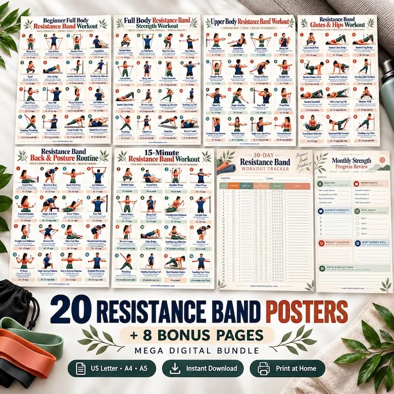
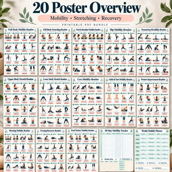
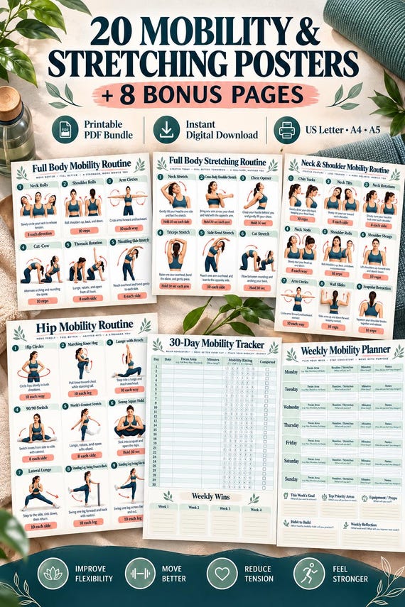
A notes sheet can tolerate a faint decorative border; an exercise illustration cannot tolerate losing a support point or directional cue. Test at least one illustration page and one writing page when both are included in the bundle. They serve different tasks and may need different print choices.
Look for overlap between the body outline, clothing, equipment and background. If similar shades merge, a movement position may become harder to interpret. Grayscale is not a reason to guess where a hand or foot belongs. You can choose color for the reference pages and grayscale for the logs if that preserves clarity. A mixed print approach often makes more sense than applying one setting to everything for the sake of uniform appearance.
Use a small comparison instead of a full run
Print the same representative page in the options you are considering, using the same paper if possible. Write the option name on the back so you can compare the fronts without forgetting which is which. View them at the actual reading distance, not only close to the printer tray.
Compare three practical points: can you identify the page's main task, can you read the smallest necessary label and can you make an entry without it blending into the artwork? These questions are more useful than deciding which print looks most dramatic. Choose the option that satisfies the task with comfortable clarity. If none does, a different layout or a larger reference may help more than repeated changes to printing quality.
Maintain meaning when you archive the planner
A completed grayscale sheet may later be photographed, scanned or photocopied. Keep abbreviations and status marks consistent so their meaning does not depend on a specific shade. Put a tiny written key on a notes page when you introduce symbols. For example, an arrow beside a date can mean rescheduled only if you have defined that use clearly.
When storing a scan, inspect one full page to confirm that light pencil and pale lines survived. Keep the paper original if it remains the more readable record. Name the archive by date and subject rather than by color setting alone. The successful result is a planner whose information remains understandable across printing, use and storage. Grayscale is a format choice that supports that result, rather than a guarantee of lower cost or better usability in every situation.
Choose grayscale by testing essential labels, illustration cues and your own writing; keep color where removing it would remove meaning.
Written for general information by The Better Plans. Exercise and wellness content cannot diagnose a condition or replace individual professional advice. The Better Plans also sells digital products on Etsy, but this article is free to read and requires no purchase. Read our editorial policy or send a correction.