 THE BETTER
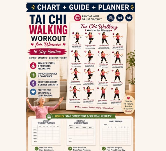
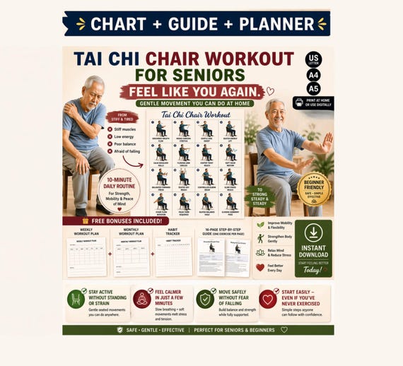
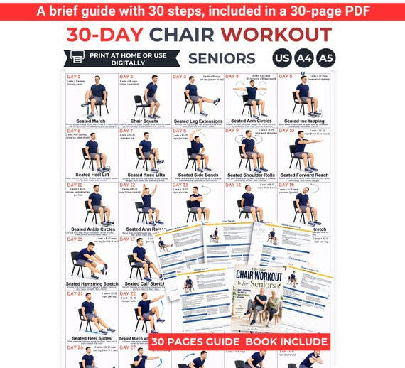
A reference page can look spacious on a desktop and become awkward on a phone. Seated Tai Chi documents may combine illustrations, small captions and sequence numbers, so digital readability deserves its own check. This article compares reading formats by navigation rather than by exercise content. It does not explain technique or decide whether a reference is appropriate for an individual. The goal is to find a format in which you can locate a label, enlarge it and return to the page without losing your place. Test actual files on the device you expect to use, not only promotional photographs of a tablet.

Begin with the smallest label
Open a representative detailed page and locate its smallest instruction or caption. Enlarge that area until you can comfortably read it. Check whether the text remains clear and whether the image beside it still provides the context you need to understand the label. A large title tells you little about the rest of the page. If a preview is available, use it to inspect the real density of information. Do not assume all pages share the same layout. One readable cover cannot establish that a tightly arranged sequence page will work on a small screen. Record which page you tested and what made it easy or difficult to consult.
A fictional comparison might include file A with twelve panels and file B with larger individual panels. Test the least prominent caption in both. Your note can say caption readable at comfortable enlargement, but sequence number disappears outside the view. That observation describes the reading problem more precisely than declaring the whole PDF mobile friendly.
Test returning to the sequence position
Zooming into one panel can hide the sequence markers around it. Before choosing a file format, test how you return to the overview and find the same panel again. Numbered captions, consistent panel titles and an unobscured page heading can help. Keep any personal bookmark separate from the creator's directions. If you use a digital annotation, place it where it does not cover arrows or small labels. The aim is document navigation, not adding new physical instructions. A file is easier to consult when its reading landmarks remain identifiable across both a close view and the full page.
Try this imaginary task: open panel six, read its caption, return to the overview and locate panel six again. If you repeatedly lose the position, record the missing landmark. A personal note with page and panel numbers may help, but it cannot supply a sequence definition absent from the original resource.

Compare single-page and multi-page navigation
A single-page reference keeps the whole arrangement together but may require more zooming. A multi-page format can provide larger panels but may make it harder to compare neighbouring references. Examine how the document names its pages and whether continuation is clearly stated. This comparison is about how you read the file, not a general verdict that one format teaches better. Test the exact task you expect to perform: looking up one named reference, returning to an overview or finding a related explanation. A format that works for one task can be frustrating for another. Keep the intended task beside your comparison notes.
For example, someone looking up a single named caption might prefer a clearly titled page. Someone reviewing the arrangement might prefer an overview with visible numbering. Try both tasks before deciding. If the multi-page edition lacks a content list, note that limitation rather than assuming its extra pages automatically make navigation clearer.
Inspect orientation and reading controls
Try the device orientations you ordinarily use and observe what changes in the visible page. A landscape view may show more of a wide reference while a portrait view may suit a narrow page. Device settings and viewer controls vary, so do not rely on a universal menu description. Use the controls actually available in your reader and check whether page navigation remains visible at your preferred enlargement. Avoid tapping unfamiliar controls during a task that needs concentration; explore them while simply reviewing the document. Save a neutral setup note if a particular view makes reading easier for you.
A sample note could read: landscape shows panel title and caption together; portrait requires horizontal movement; viewer page indicator stays visible in both. That records observed behaviour on your device. It should not claim the same file will behave identically in every application or solve every accessibility need for another reader.
Check contrast without obscuring illustrations
Assess the actual label contrast and background rather than judging readability from a bright mockup. If your reader offers display adjustments, test them on the detailed page and confirm that important arrows, outlines and labels remain distinguishable. An adjustment that helps text can alter an illustration's appearance. Record the tradeoff instead of assuming any darker or brighter setting is universally preferable. If you need another edition, ask whether the creator supplies larger labels or clearer formatting. Do not enhance an unclear direction yourself in a way that changes its apparent meaning. Readability and instruction accuracy need to be preserved together.
Imagine a display adjustment makes a pale caption clearer but turns two arrow colours into similar shades. That is a useful comparison finding. Check for explicit arrow labels and ask for clarification if the colours carry an undefined meaning. A viewer setting cannot repair a missing explanation, even when it improves the appearance of the page.
Keep notes in a separate readable layer
A small screen leaves little margin for comments. Choose where you will keep navigation notes and questions before annotating the file. A separate note can identify the filename, page and panel without covering the original. If the viewer supports annotations, test whether they remain legible and whether you can hide them to inspect the unchanged page. Keep original purchased files intact. This separation makes it easier to ask a seller about a caption or show a complete page to someone qualified to explain it. It also prevents your own shorthand from looking like part of the published instruction.
A fictional note might say: reference file, page three, panel two; caption not fully visible in normal overview; ask for larger-text edition. Link it to the page in whatever way your reader supports, or keep the note beside the filename. Avoid placing a large question symbol directly over the illustration where it could hide an important label.
Make a device-specific format decision
Finish with a modest conclusion describing the file, device and task you tested. Suitable wording might be readable for looking up named panels on this tablet. Avoid a broad accessibility claim based on one person's brief inspection. Reading needs differ, and some documents may require formats or support beyond simple enlargement. Keep any unresolved instruction question separate from your format preference. A comfortably readable page can still be incomplete or unsuitable for your intended use. Choose based on the evidence of your reading trial, then revisit the decision if your device, viewing application or needs change.
Your summary could list smallest caption, return-to-panel task, overview clarity and unanswered questions. Keep a sample page available so you can repeat the comparison after changing devices. If no version lets you read the relevant text comfortably, ask for an alternative rather than accepting unreadable instructions because the gallery looked polished or the file contained many pages.
Compare digital references using real captions, zoom and return-to-page tasks. Record a device-specific reading result while keeping instruction questions and accessibility needs distinct.
Written for general information by The Better Plans. Exercise and wellness content cannot diagnose a condition or replace individual professional advice. The Better Plans also sells digital products on Etsy, but this article is free to read and requires no purchase. Read our editorial policy or send a correction.